‘MIXEE LABS’ CONCEPT ART RESEARCH (2016)
General info
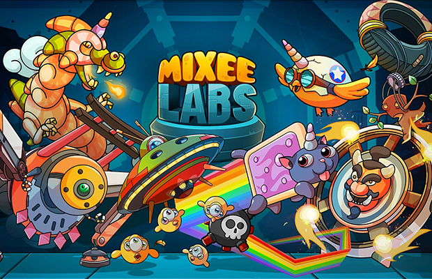
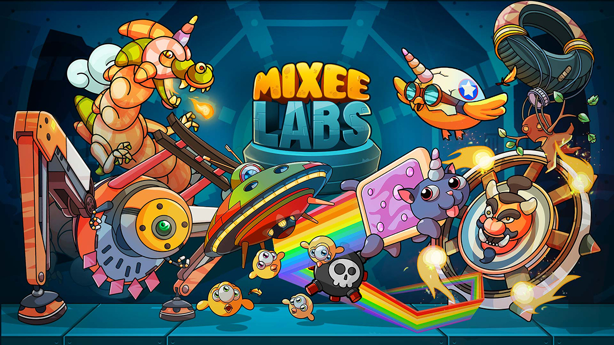
This concept art series was developed for a proposed mobile game project. The game was intended to be another iteration of the “infinite runner” genre.
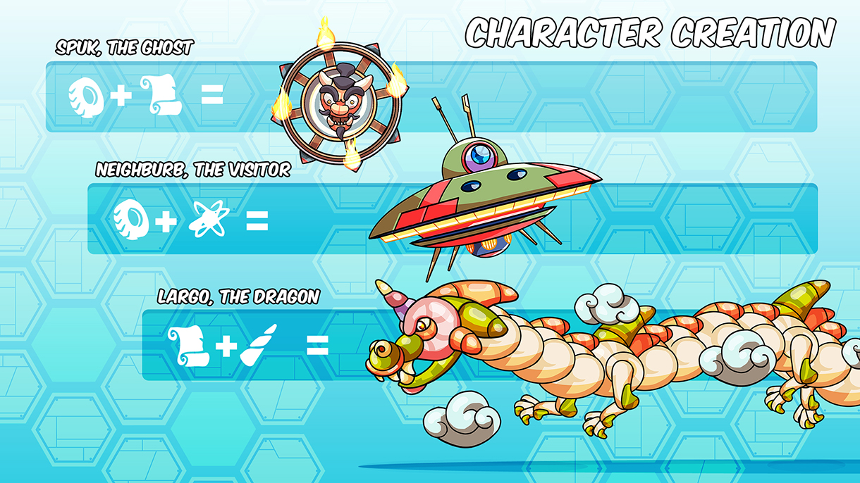
However, the game was going to include a major and original difference. Instead of one character or a few characters with similar gameplay, it was going to be playable with a large number of characters. The key: the further you advance in the game, the more “creature essences” you would unlock. These essences could be mixed together in different combinations, resulting in a different playable character for each combination.
A game like this was both a game design and visual challenge. Every character had to have its own personality, gameplay and features, while still belonging to the same game and following the same design rules. The final game project contemplated eight essences and twenty-eight characters, all of them susceptible to being evolved or modified by the player.
Due to the nature of the game, it was clear from the very beginning that it had to be a highly humorous, surreal and pleasant game, which led to a clear, vivid and simple vectorized visual style, related to comic-strip cartoons. Character animations were going to be powered by real-time physics, with small additions of traditional animation. This approach also pushed towards a clean vector style.
Developer: Kitmaker
Publisher: unpublished
Platform: Android
My role
Lead artist and concept artist.
ART RESEARCH
CHARACTERS DEVELOPMENT
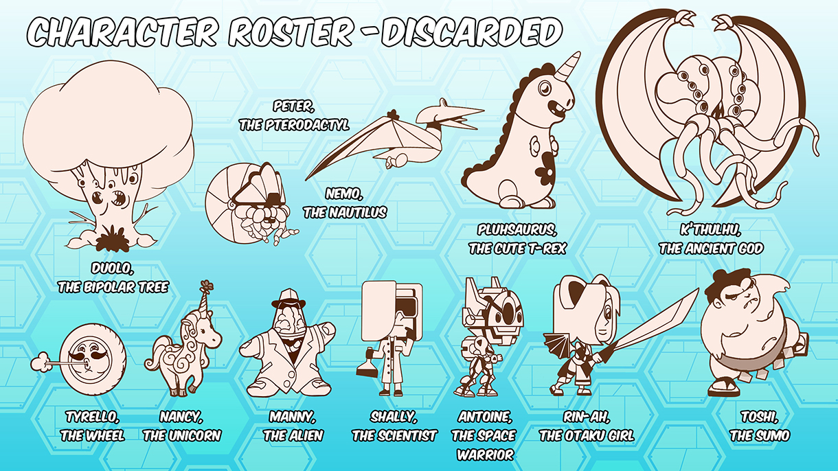
Before achieving the “essences” concept, we had to propose, design, redesign and discard literally dozens of characters while figuring out what these essences were going to be and how they would combine with each other. To manage such a large amount of visual information, I had to use panels like this one to visually present every change and decision. It took months.
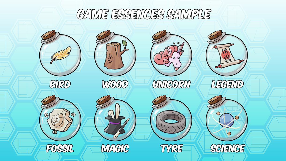
Finally, the selected essences for the game. They are quite surreal, as promised. They were not going to be available from the beginning, but would have to be unlocked as the player progressed. The final versions of these essences were designed by Katiana Alomar using my sketches and art direction guidelines.
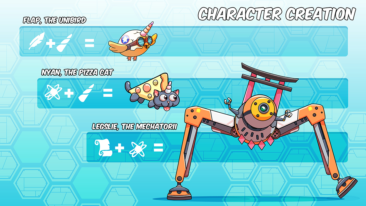
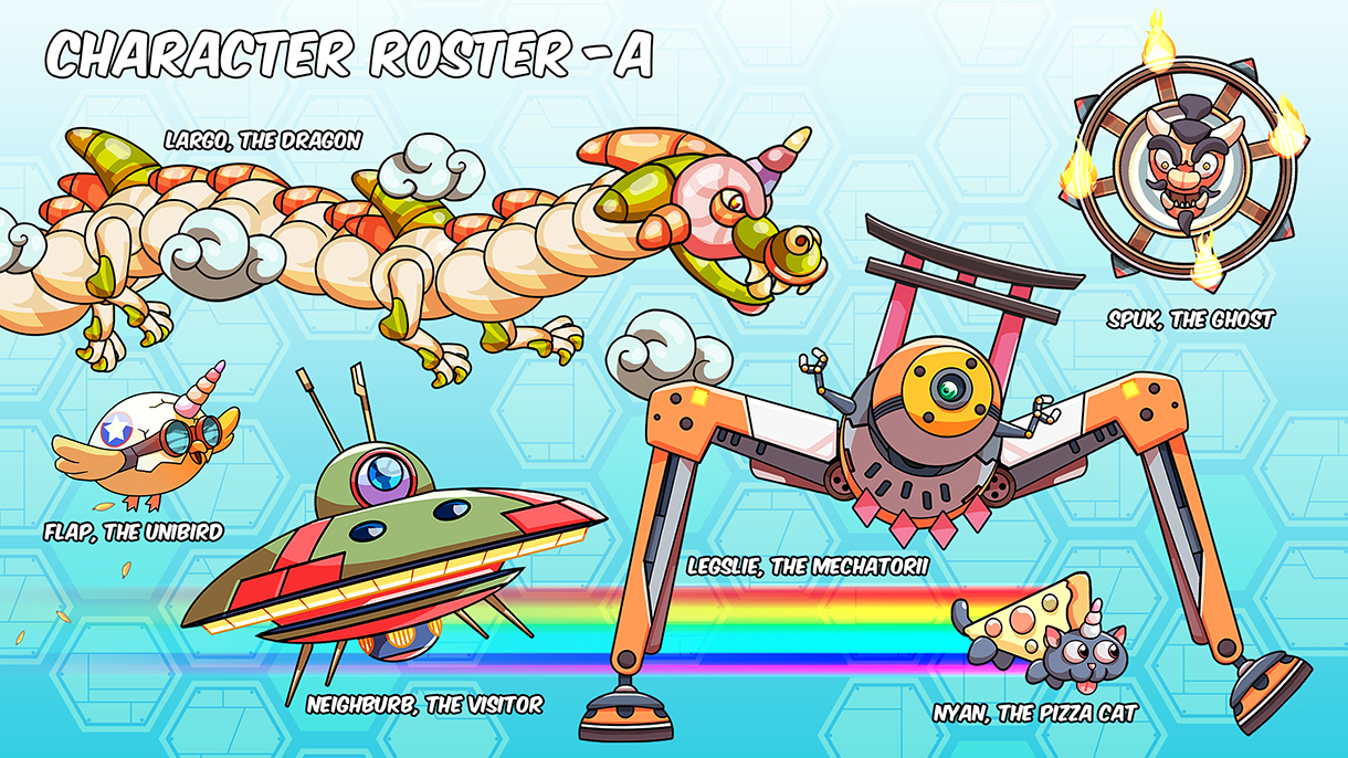
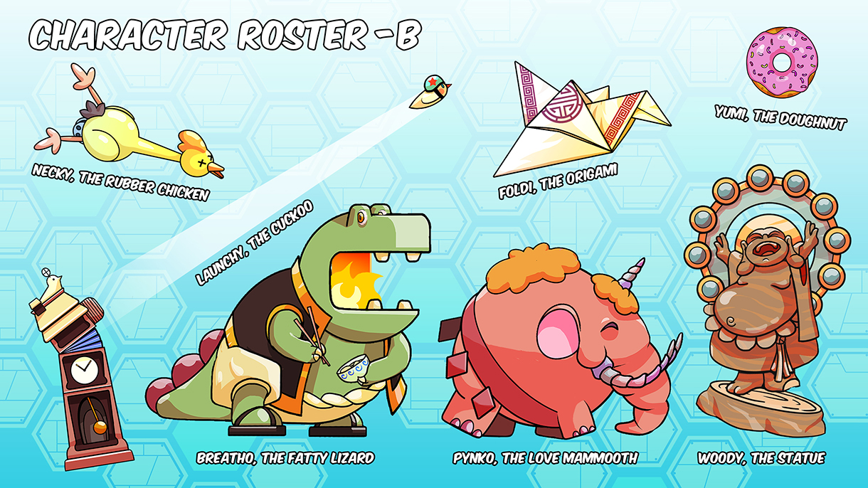
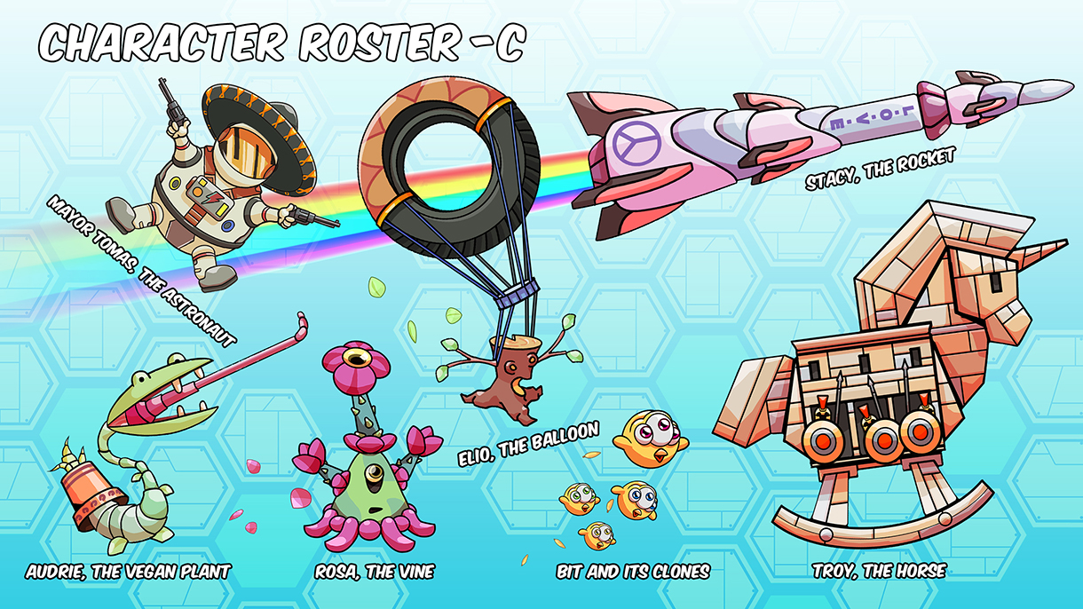
Every essence combination creates a new creature in the game’s laboratory. Here are some examples, along with the associated scientific formula, the character roster approved for development, and some discarded characters that almost made the final selection.
Some of the characters were also illustrated as high-resolution images for marketing and project cover purposes.
SCENERIES DEVELOPMENT
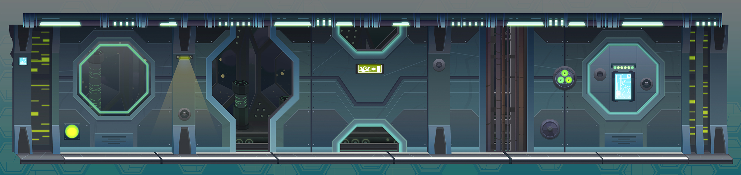
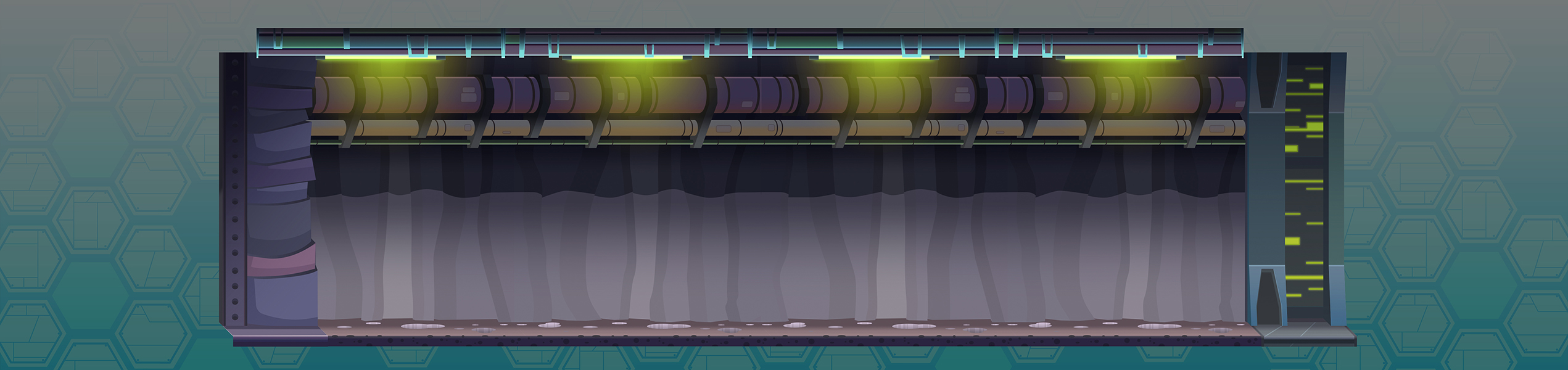
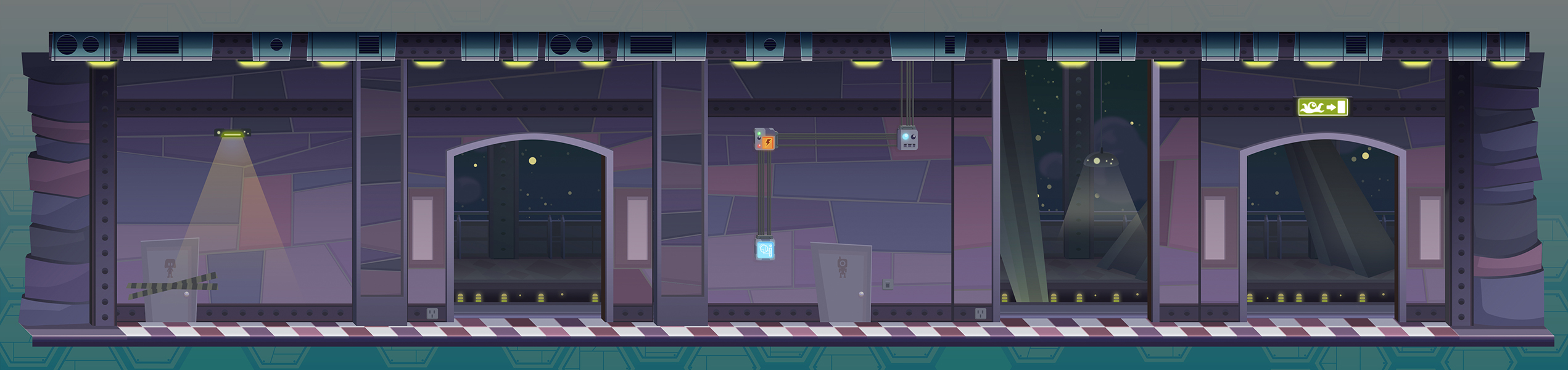
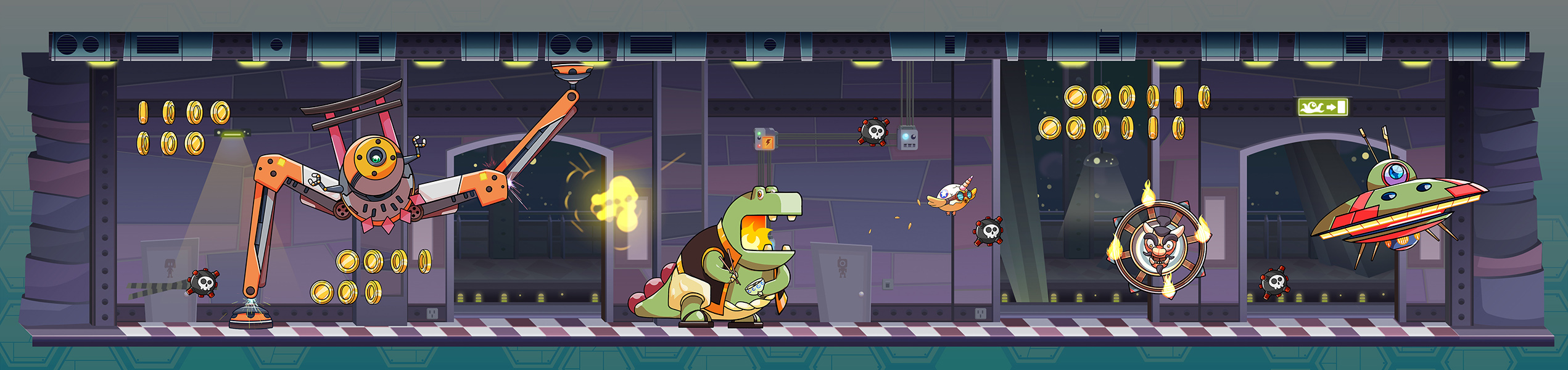
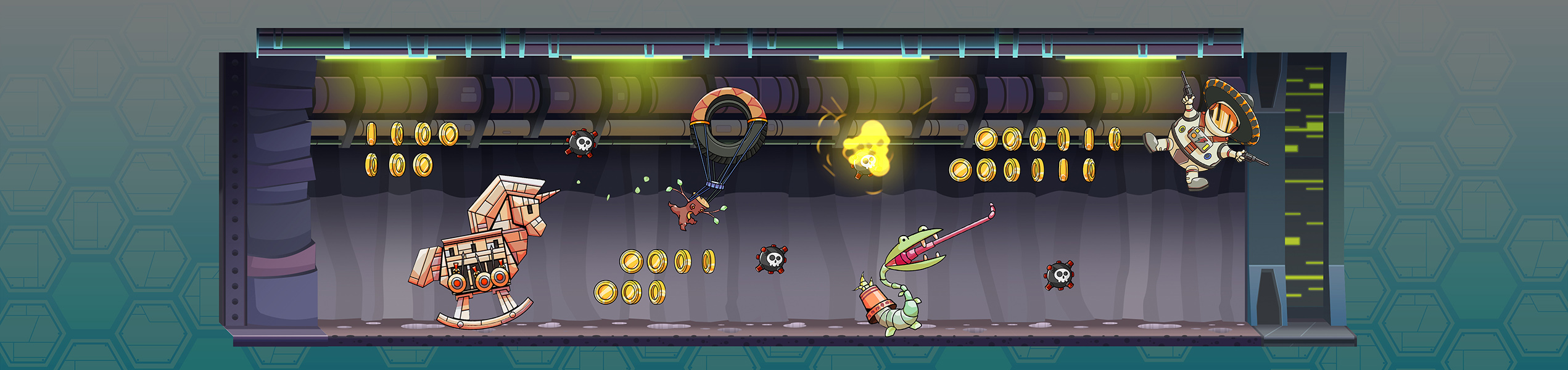
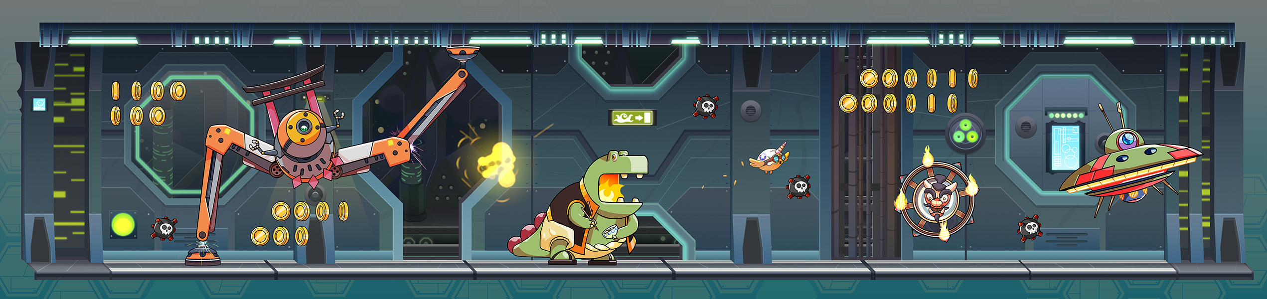
A highly humorous and vivid game like this, set in some kind of mad laboratory maze that the creatures are trying to escape from, needs backgrounds that add crazy details and atmosphere. Following the design guidelines established for the characters, a simple and clean visual approach was chosen. Outlines were discarded, and a paler, colder, darker and more desaturated palette was used in order to achieve proper separation between the characters and backgrounds.
Two main sceneries were proposed, along with a third one that would serve as a “transition” scenery, allowing the mobile CPU to unload and load graphic sets. When memory resources are very limited and the nature of the sceneries makes them prone to repetition, you have to use some visual tricks: introducing small hue and saturation changes among similar pieces, making small variations to patterns, and creating two or three variations of every tile class to introduce some randomness. Creating sets of decorative props also helps.
First, the High-Tech Lab theme; then, a transition theme that is considerably simpler than the others and has no scrolling parallax; and finally, the Old Lab theme. More lab themes were sketched just in case they were needed: military lab, underground lab, sewer lab, circus lab, etc.
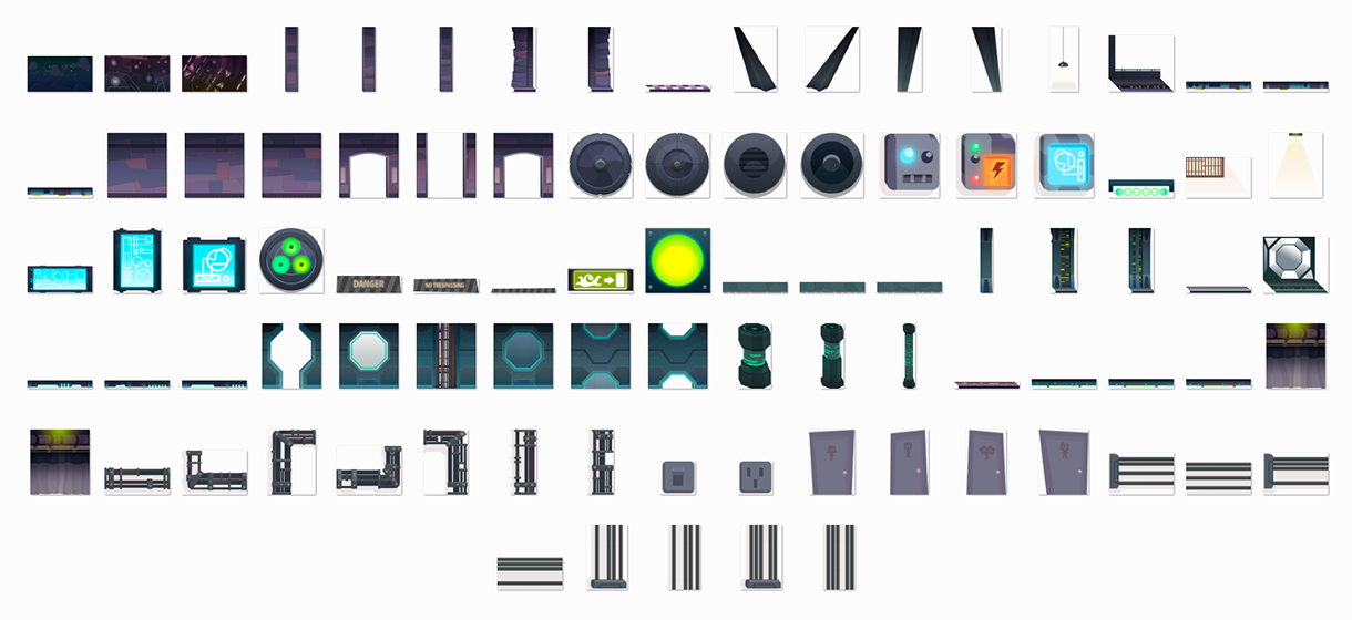
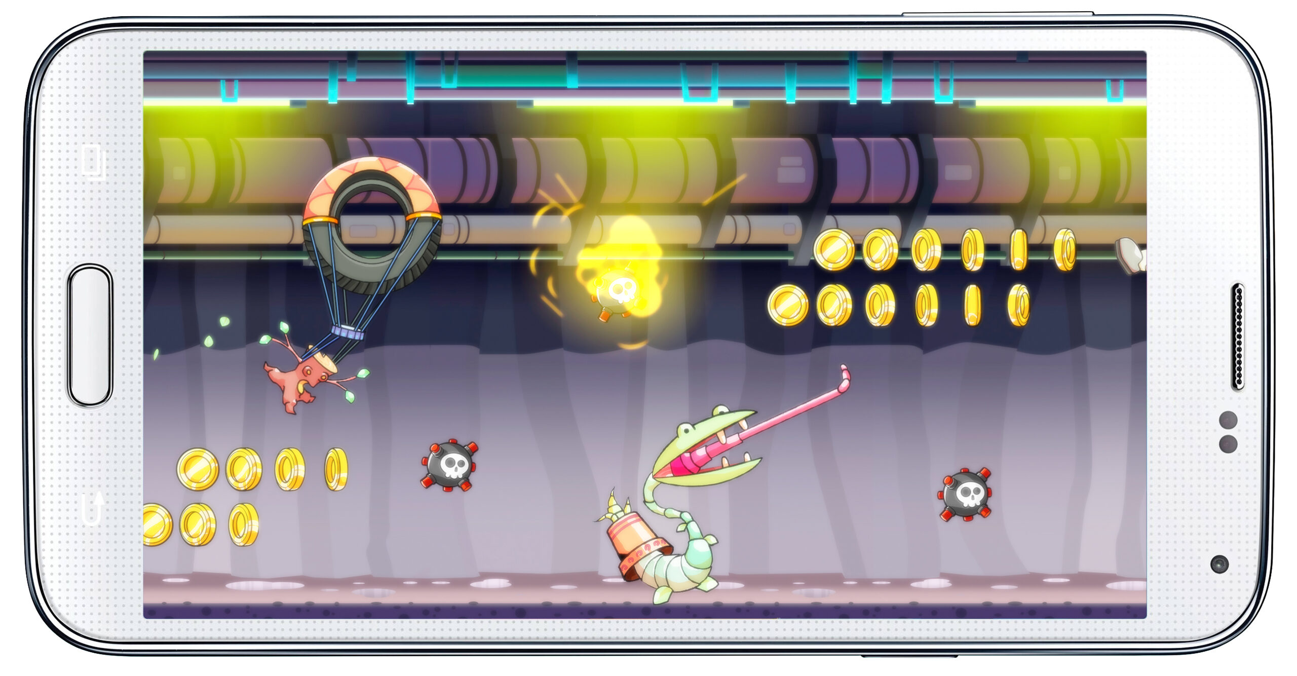
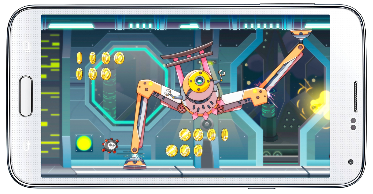
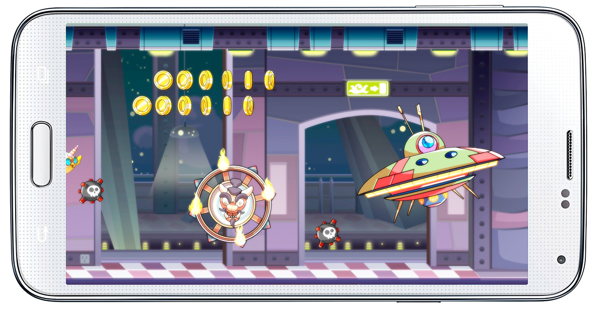
FINAL RESULT
Finally, we populated the sceneries with our characters, FX and some basic game objects. It looks nice! So much better and nicer than the fake device screenshots.
‘CAR RACING GAME’ CONCEPT ART RESEARCH (2015-2016)
General info
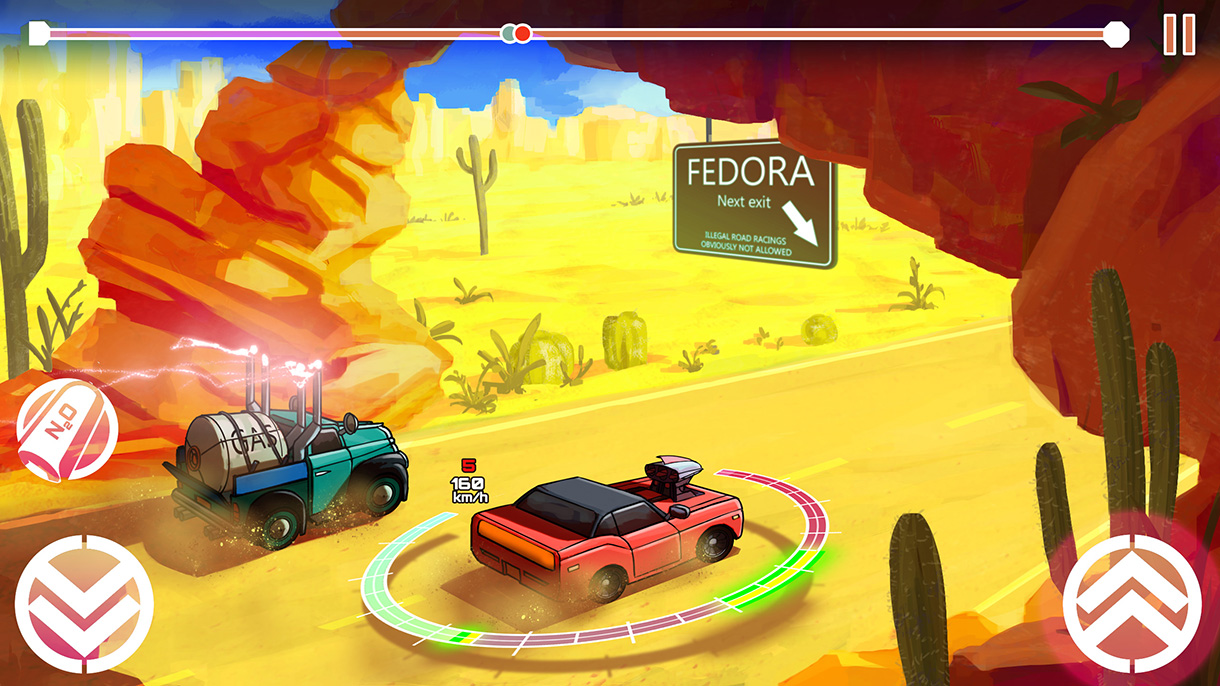
This is a selection of concept art I made for pitching the look and feel of a car racing video game project. I had to explore many different aesthetics based on the client’s requirements and feedback. The main goal was to achieve a look that would stand out from the mainstream photorealistic style used for this kind of game in today’s industry. Taking strict photorealism as one design pole, I created a pure cartoon style as the other pole and moved between them.
I believe that this research is quite interesting because of all the many different artistic choices explored.
Developer: Kitmaker
Publisher: unpublished
Platform: Android
My role
Lead artist and concept artist.
ART RESEARCH
EXTREME CARTOON DEVELOPMENT
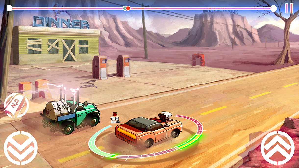
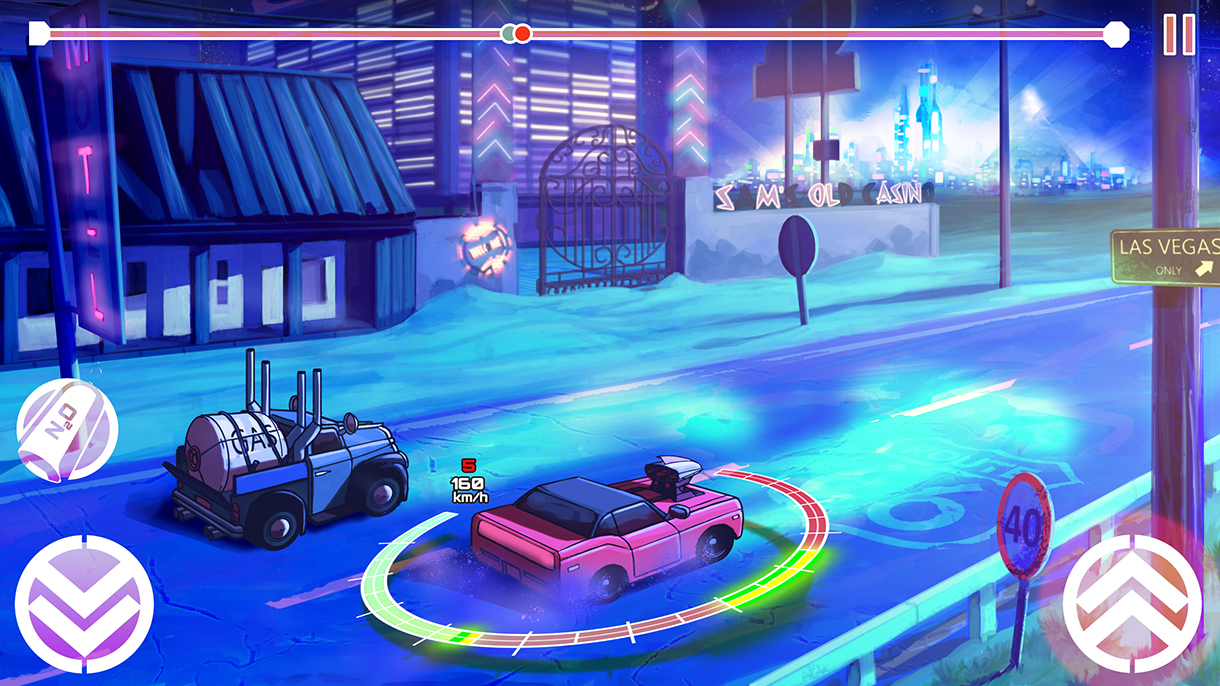
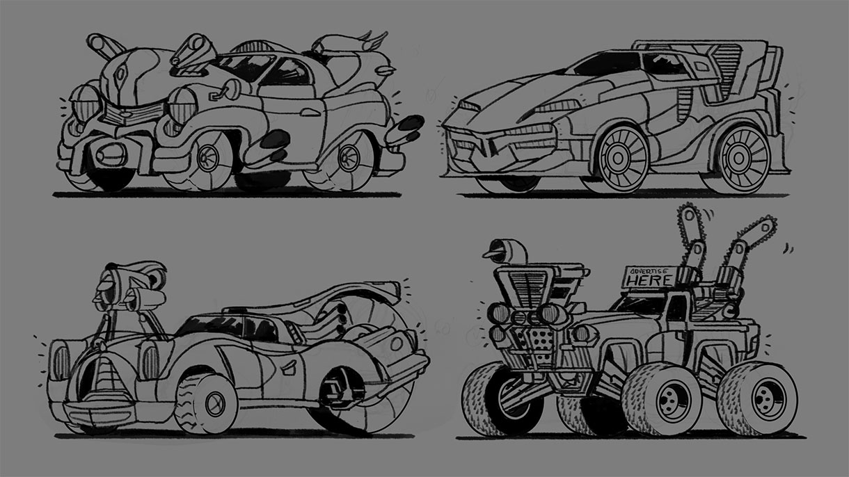
Generally, this kind of game uses real-world car models or modifies them to create recognizable models. One possibility was to explore a deformed style, playing with more or less exaggerated designs. Although the client was confident in a realistic approach to the shapes, this was a solution worth exploring.
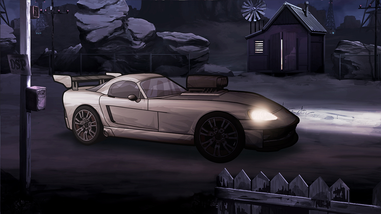
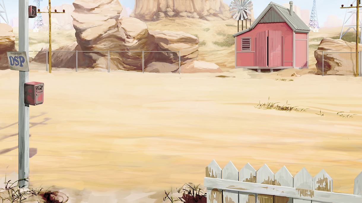
The extreme cartoon style chosen as a design reference pole is depicted in these concept arts. Finally, exaggerated and saturated sceneries were combined with realistic but smoothed and slightly deformed cars. The proposal also includes a fake UI in order to provide a better basis for evaluation.
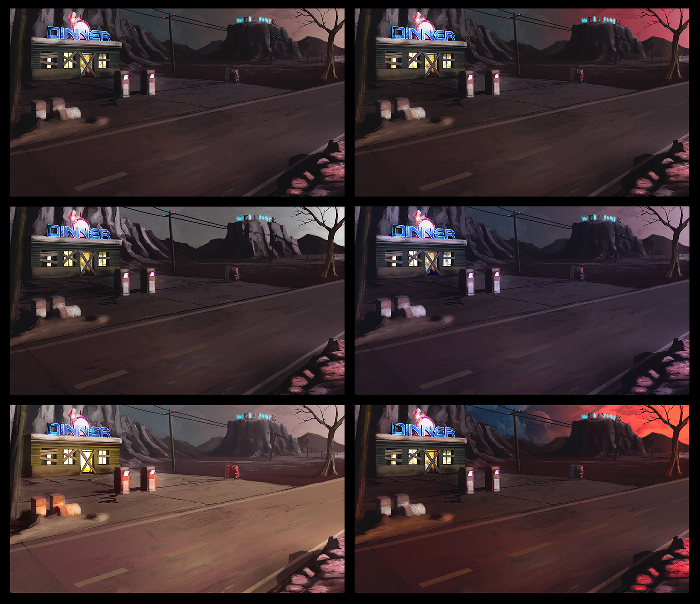
Many times, I had to rework a concept art piece in order to provide different lighting and atmosphere solutions.
MODERATE CARTOON DEVELOPMENT
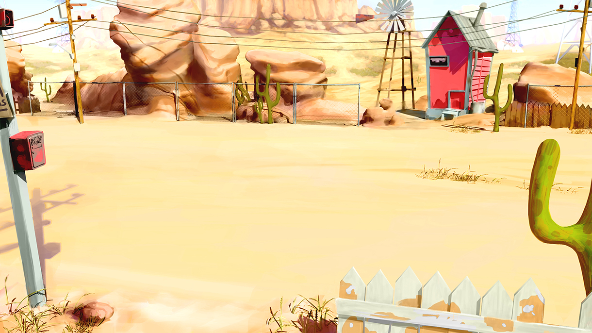
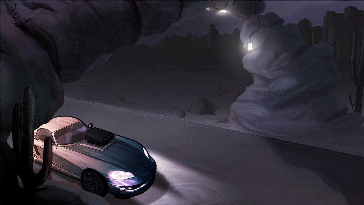
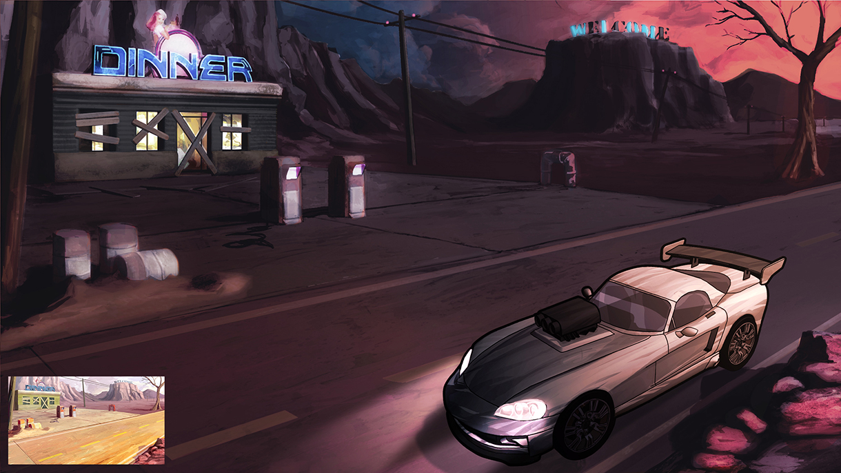
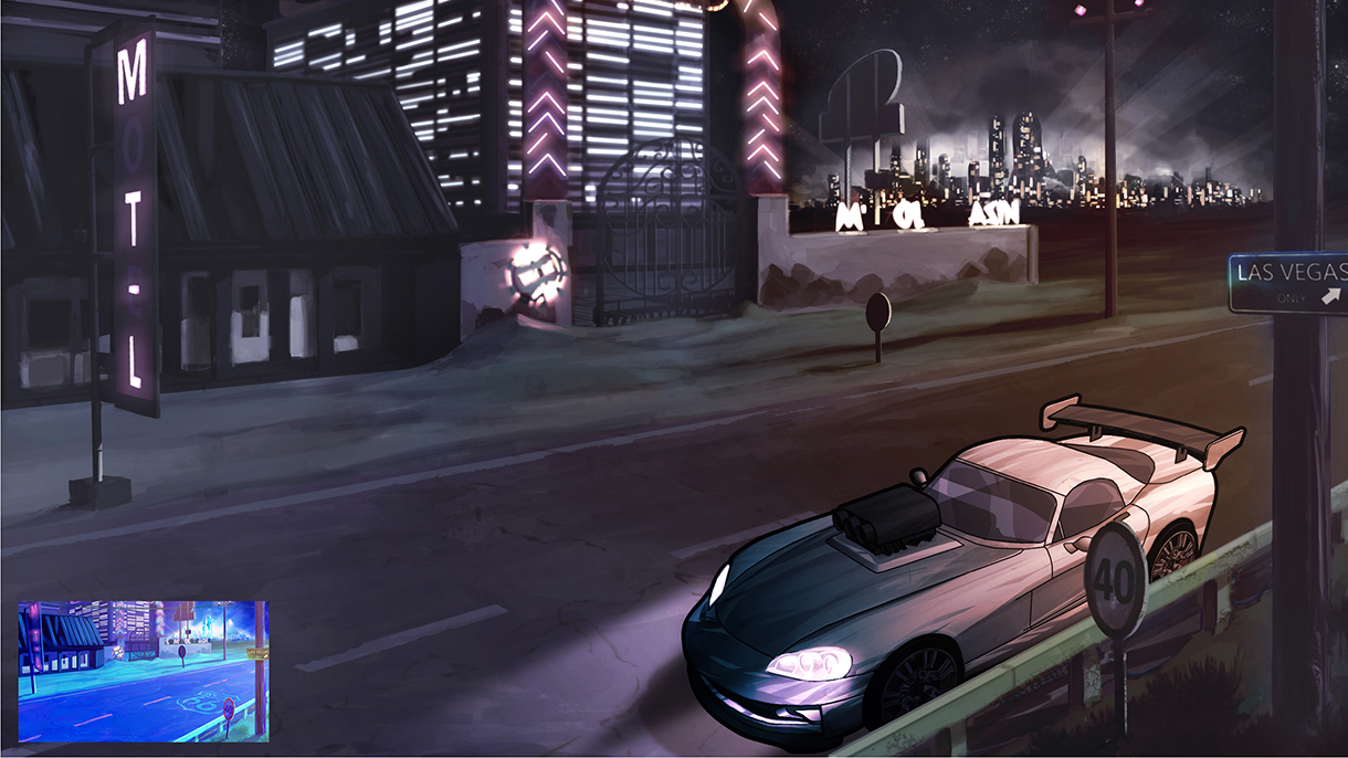
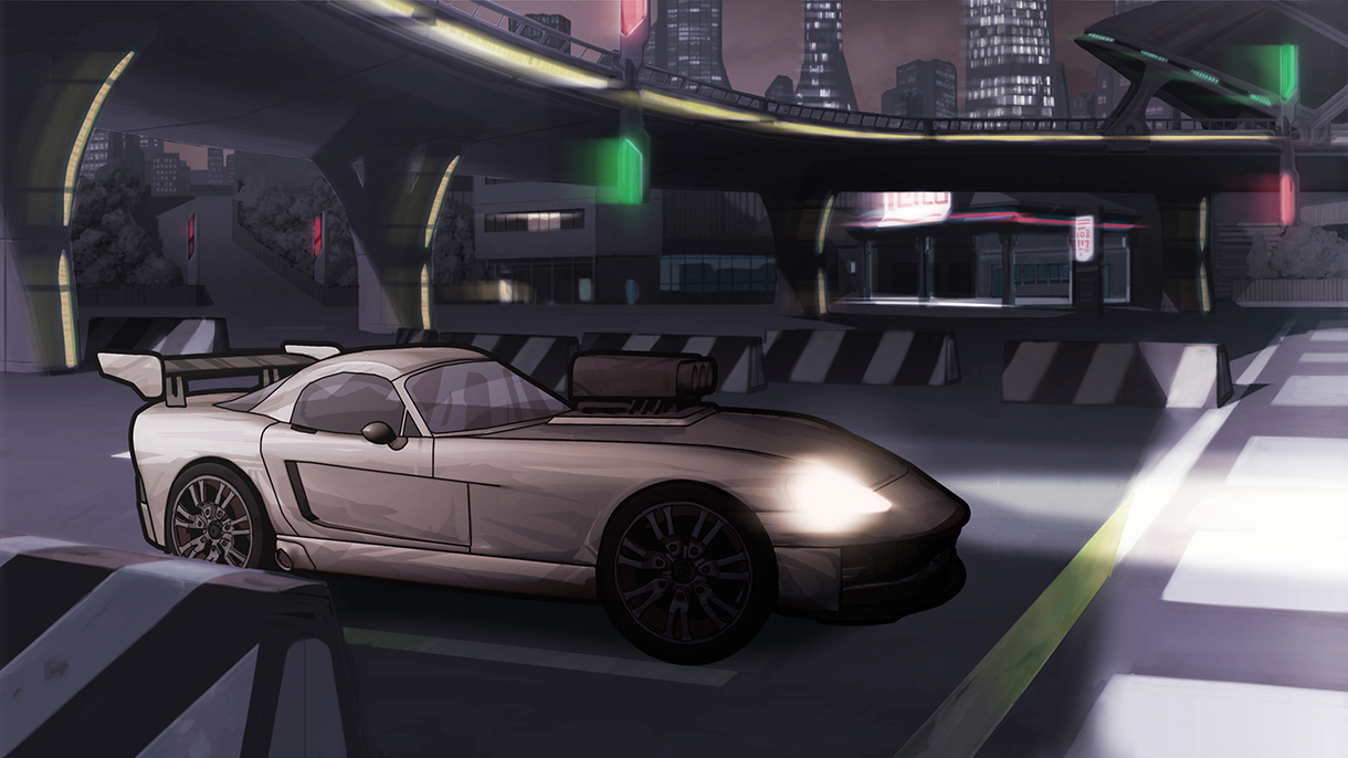
Moving to an intermediate step between photorealism and the previous cartoon style, I developed a more sober style that was still cartoonish, thanks to smoothed details and a proper outline around the game cars. Due to schedule constraints, we decided to recycle previous cartoonish concepts by re-rendering them using a more realistic shape solution and color atmosphere. Those, plus the addition of some fine details, proved to be a valid time-saving solution.
As happened with many of the previous concept arts, I was required to find many different lighting and atmosphere solutions.

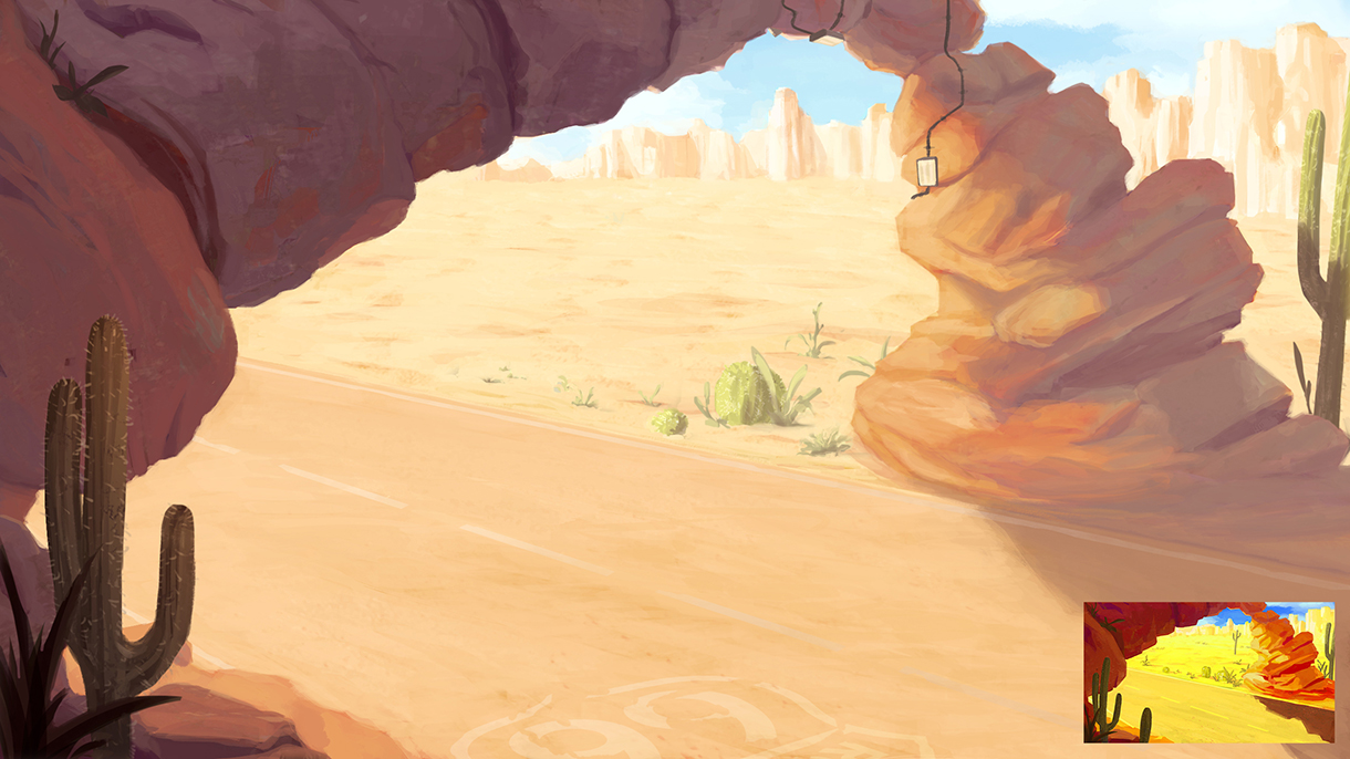
GAME ENGINE LOOK & FEEL TESTS
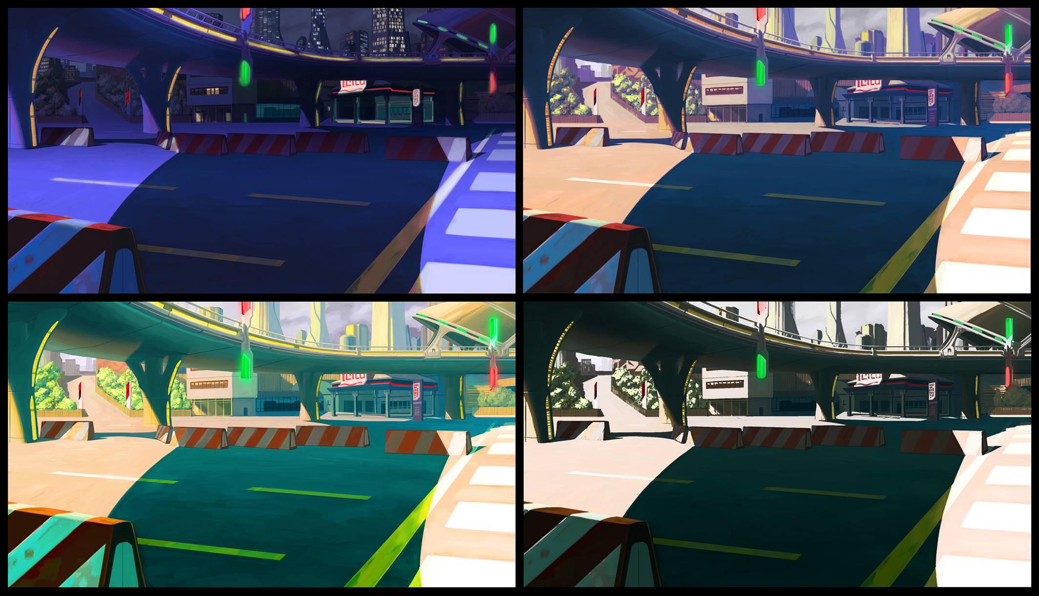
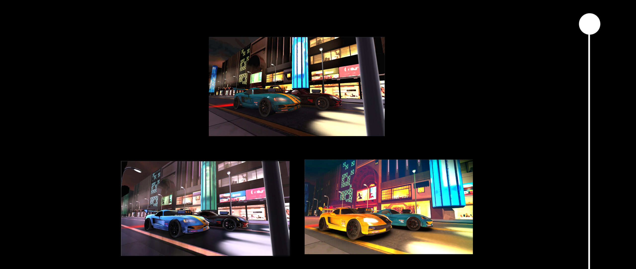
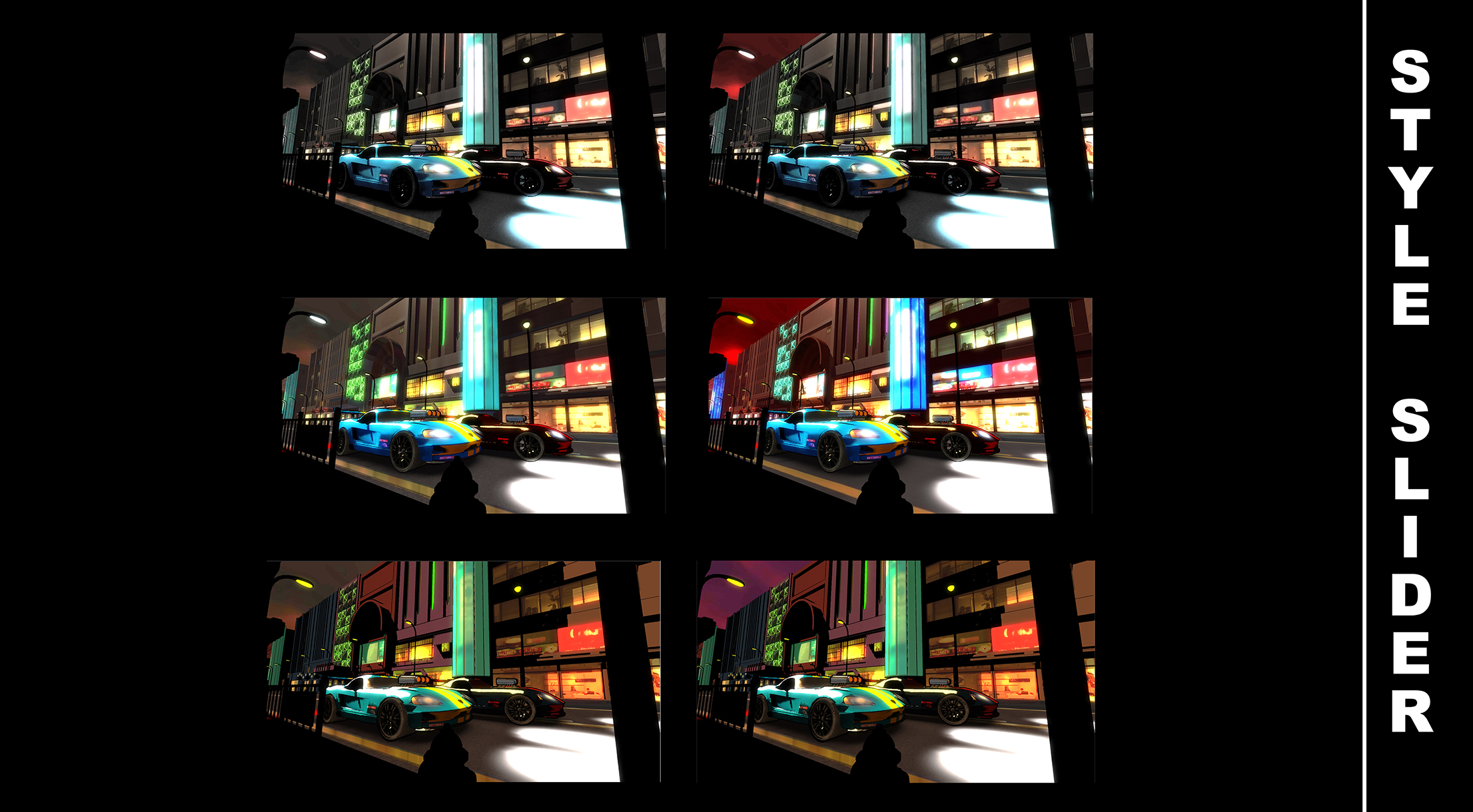
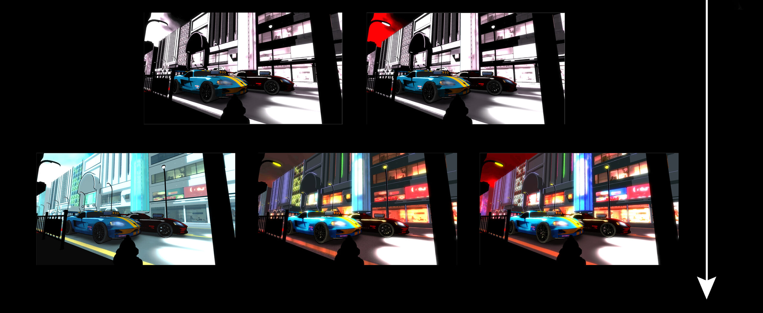
The client was worried about how to translate those aesthetics into the chosen game engine. At this point, it was clear that the approved approach for the project’s shapes was a realistic but smoothed and refined one, so the variations had to be developed by playing strictly with lighting, rendering and atmosphere. This is an easy goal to achieve using a game engine scene with the same meshes in each proposal, and much quicker than painting each one individually. My pipeline at this stage consisted of creating a quick paint sketch to find a new approach and, after that, trying to replicate it in the game engine using car and city meshes based on my own concepts. Only the game engine tests are of sufficient quality to be shown here.
A great number of possibilities, ranging from strict photorealism to increasingly refined cartoonish or comic-book styles, were provided, demonstrating that all the previous aesthetics and many more were practically achievable. In these images, you can find different styles proposed, many of them related to animation, anime, comic books and graphic design.
‘THE GOOD DINOSAUR’ ED TABLET (CLE12054) (2015)
General info
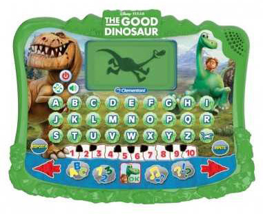
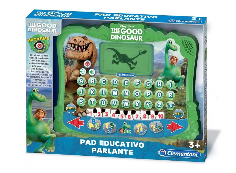
The Good Dinosaur tablet is an educational pad featuring lots of games for your free time, where you can learn the alphabet, numbers and shapes.
Developer: Clementoni
Publisher: Clementoni
Web: Future Art Shop
My role
Main artist and animator.
Gallery
VECTRON: RETURN TO 1979 (2013)
General info
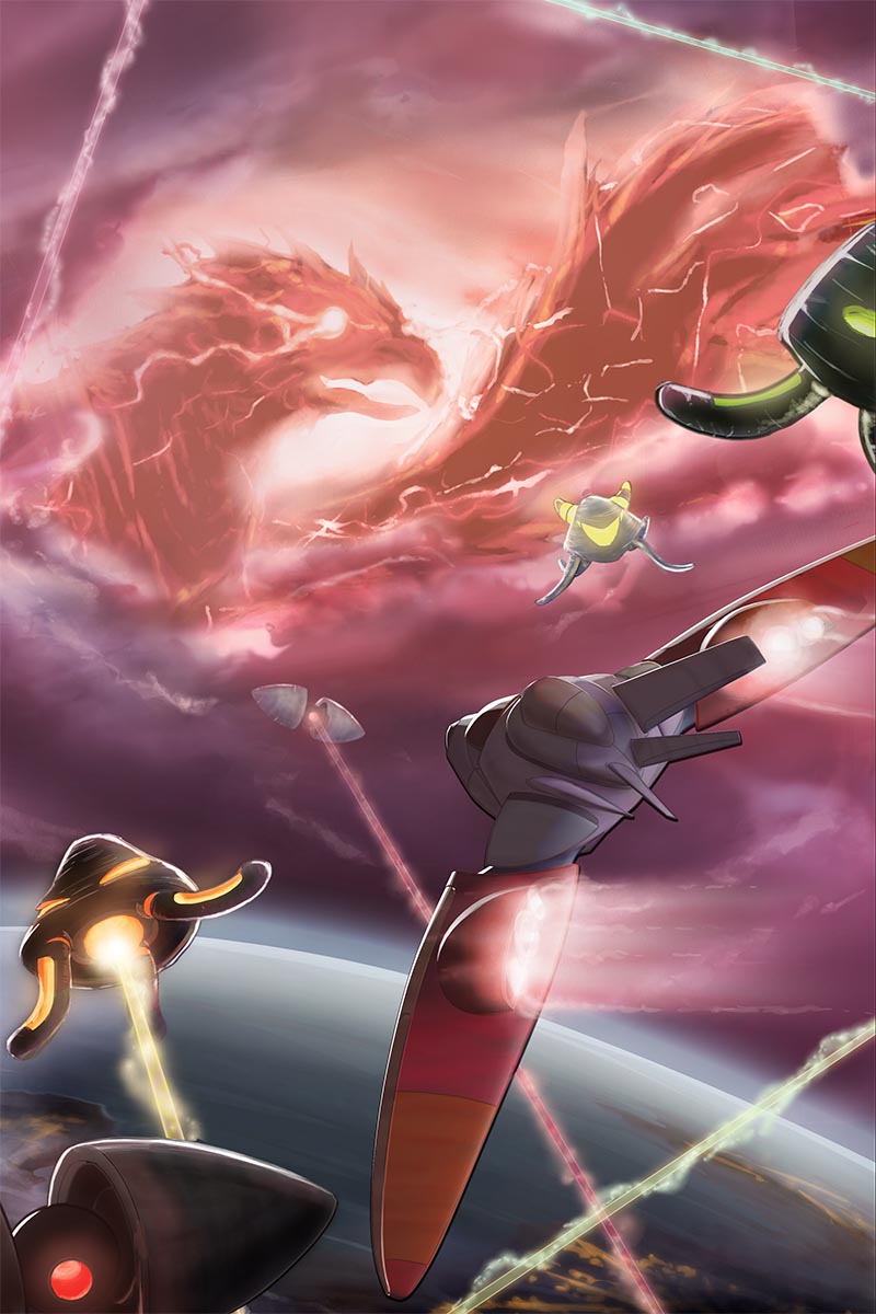
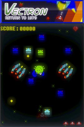
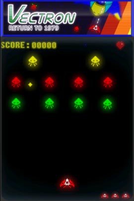
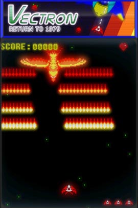
Vectron, takes you back to 1979, when arcades where something brand new and the graphics where not as important as now. If you liked SpaceInvaders and Phoenix, you will love this game, with the sounds and feeling of true arcades from dose days.
Developer: Dolores Entertainment
Publisher: Dolores Entertainment
Web: Apple AppStore site.
My role
Cover splah screen art and GUI art.
Gallery
THE ALPHABET GAME / PASAPALABRA (2012)
General info
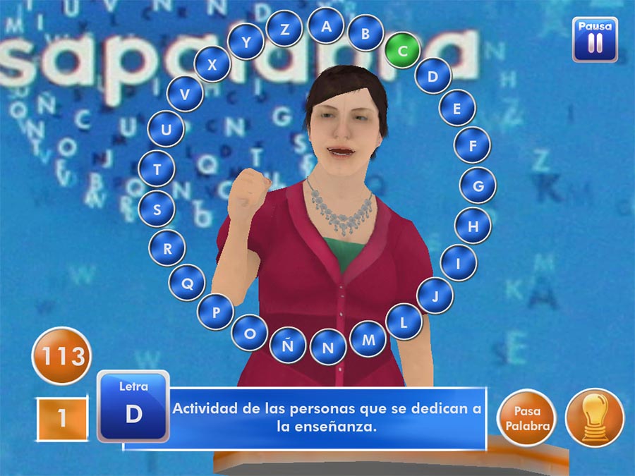
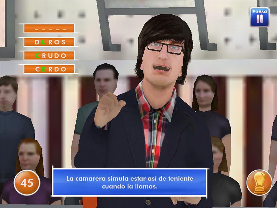
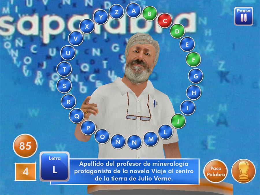
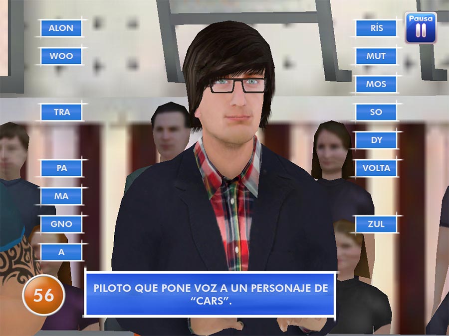
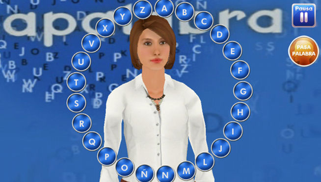
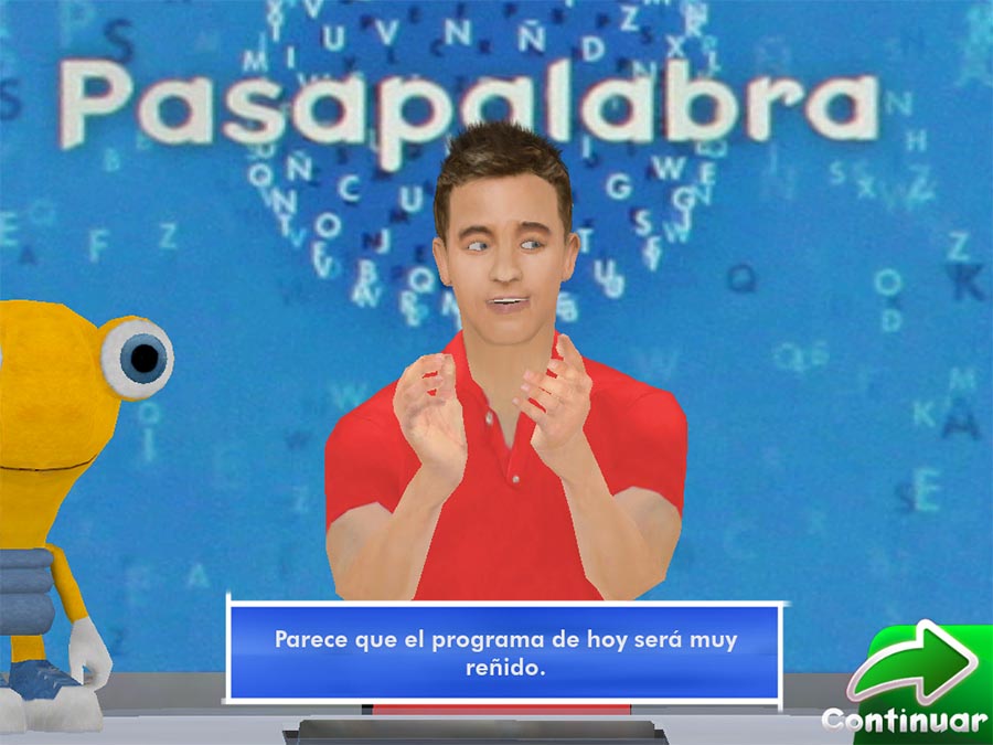
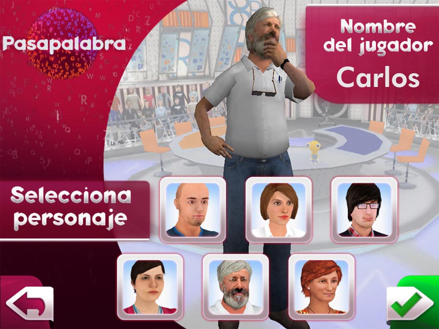
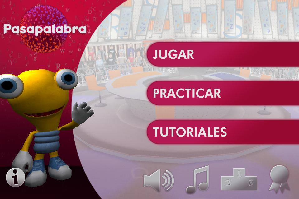
“Introducing the game version of the succesful TV program based on alphabet and words. Will you be able to complete the famous letter ring? Get enough seconds to find out it or play in Ring mode against your friends. You will get the same experience as Pasapalabra contestants!”.
Developer: Dolores Entertainment
Publisher: Mediaset.
Web: Apple AppStore site.
My role
I worked on this game as the 3D & 2D Supervisor, specializing in character design, 3D character model corrections, and GUI graphic design.
Gallery
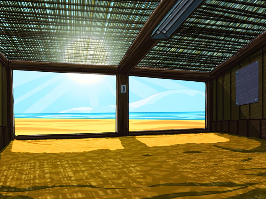
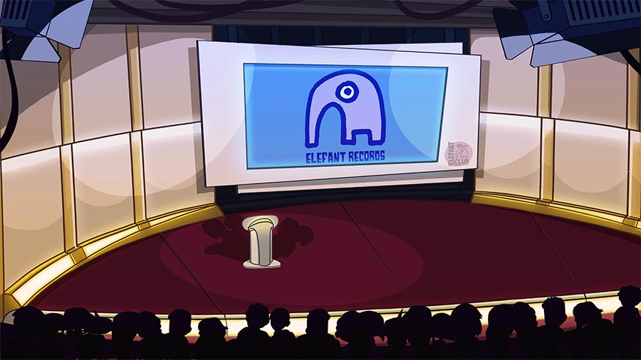
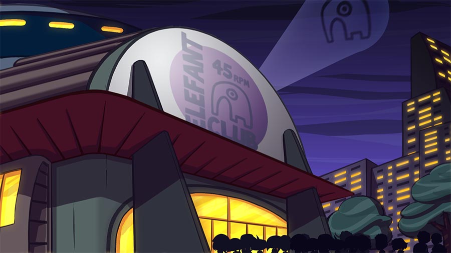
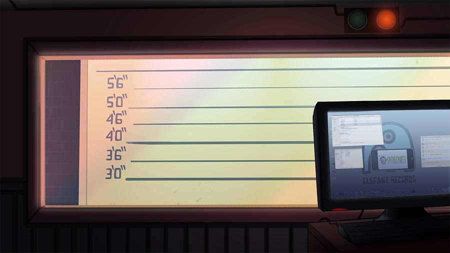
L-FUN 45 (2011-2012)
General info
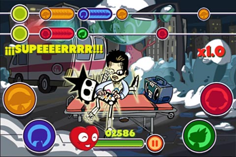
This game won appreciation as 2nd best 2011 iOS music game for “L-Fun 45″ at BestAppEverAwards.
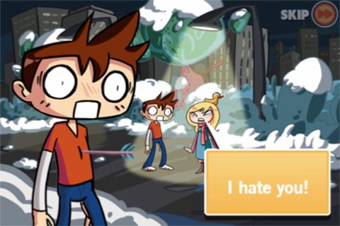
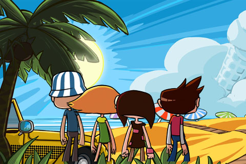
“Help Nathan getting back his love in this indie musical for iPhone! Play the rhythm game and keep up with the music to find your summer fling. Charismatic characters, a funny story, indie music of your favourite Elefant bands and a mini game. Play with the songs from many of The School, Helen Love, La Casa Azul, Papa Topo, Fitness Forever, Cooper, La Bien Querida, Band À Part and a lot more…
An Indie game with Indie music. What else could you ask for?”.
Developer: Dolores Entertainment
Publisher: unpublished
Platform: iOS
My role
This game won the 2nd best 2011 iOS music game prize from Best App Ever Awards.
Writer: story and plot first treatment.
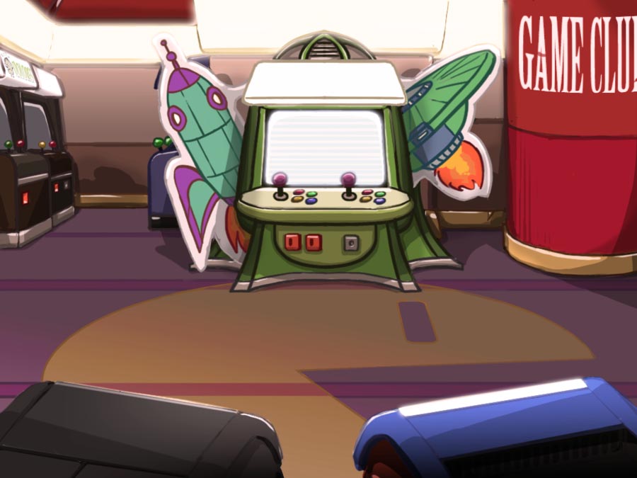
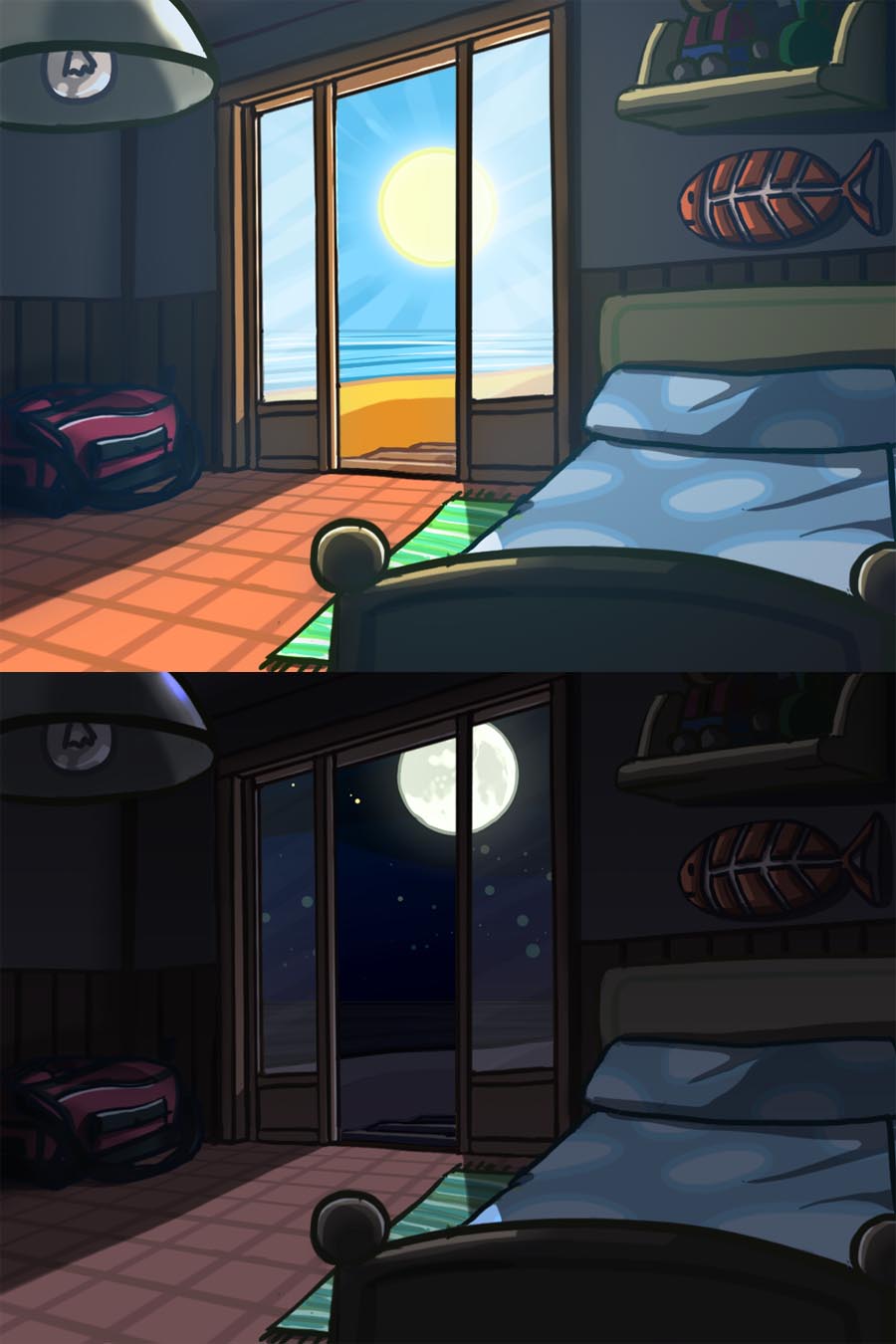
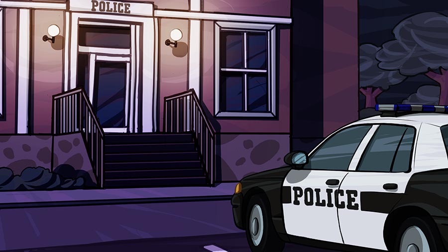
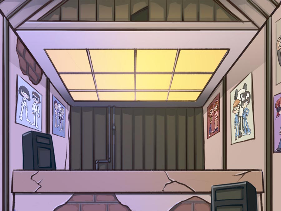
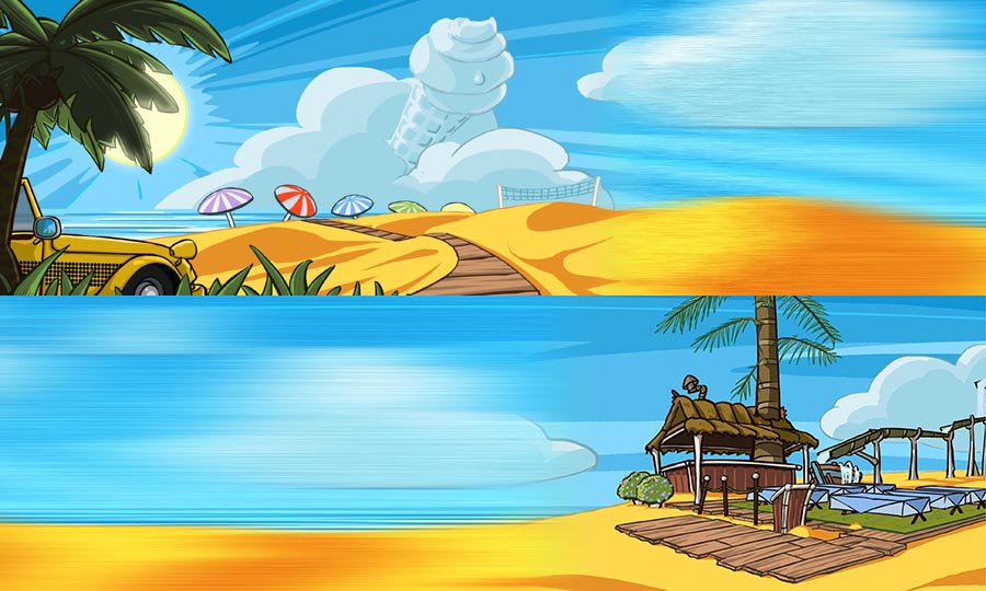
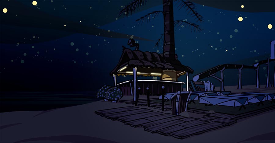
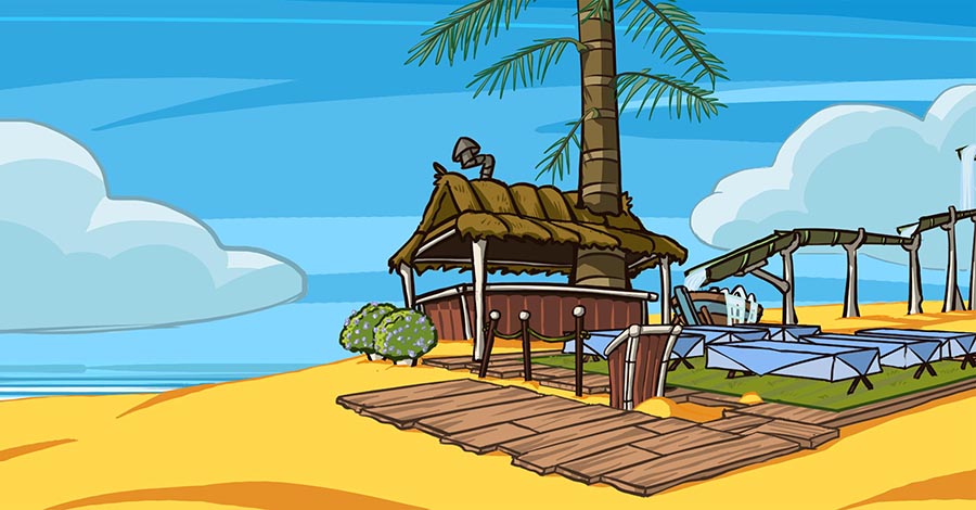
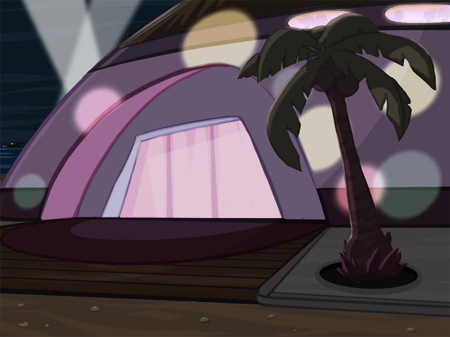
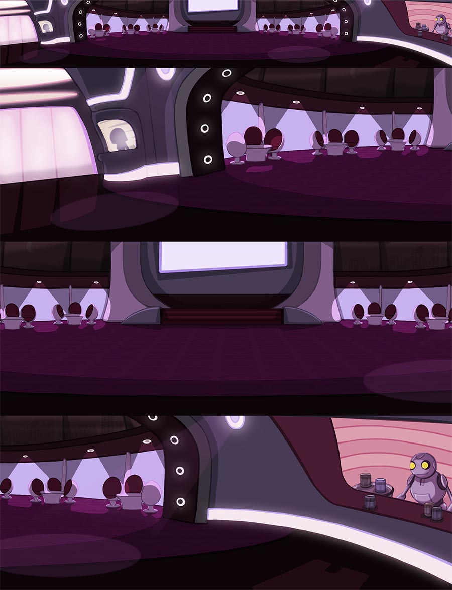
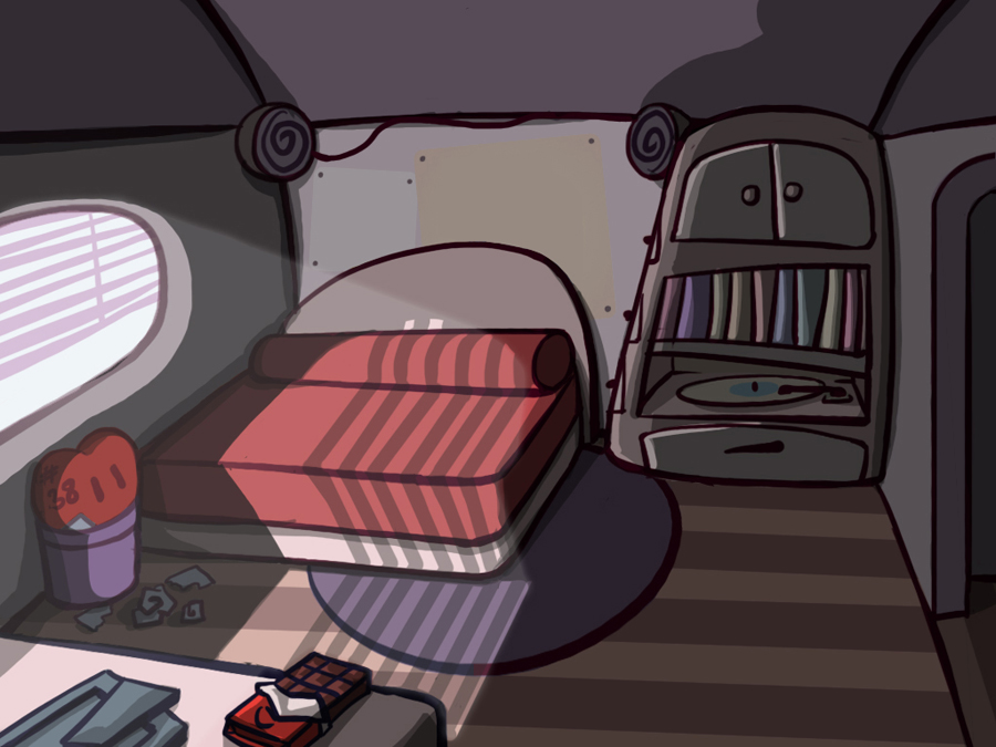
Concept artist:original character design, later reworked by another artist. Background art.
Animator: 2D animation of secondary characters.
Marketing artwork.
Gallery


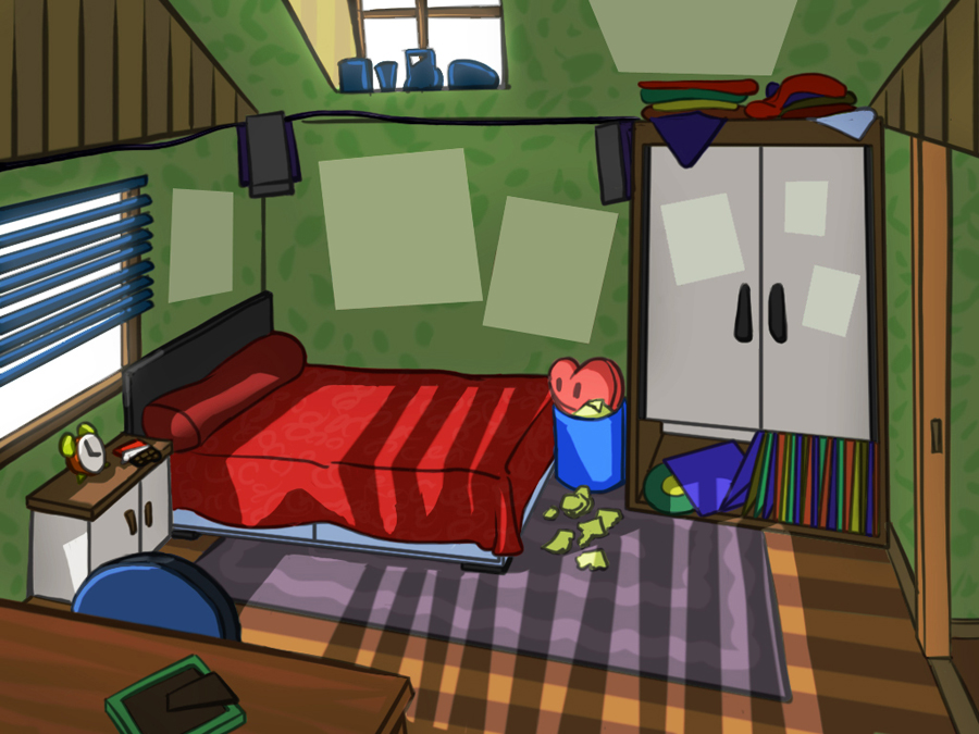

PIG RIDER FIGHTING CARDGAME (2010-2011)
General info
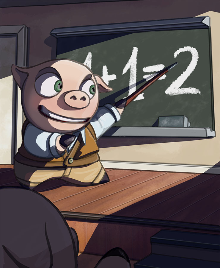
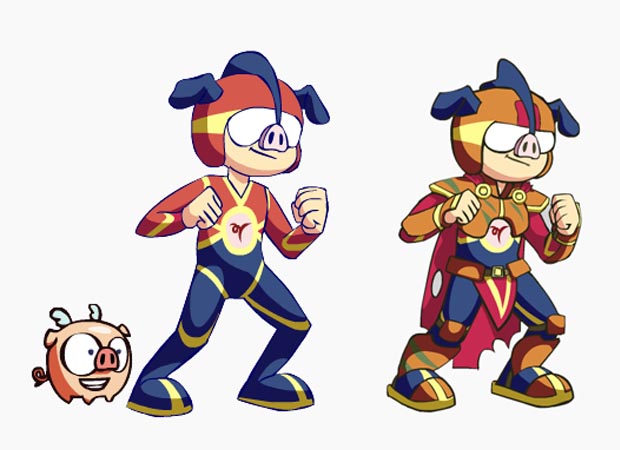
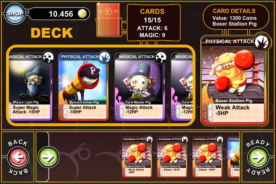
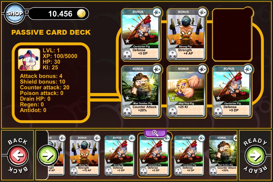
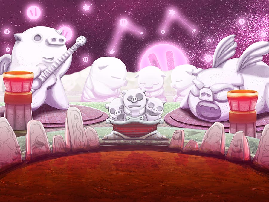
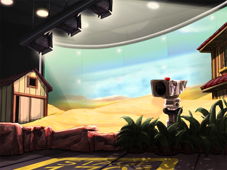
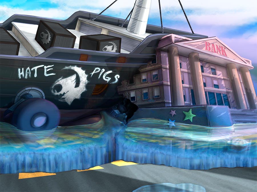
This game tells the story of a kid who finds a cracked egg containing a baby flying pig with crippled wings. They become lifelong friends, and some time after the kid grows into a teenager, they discover that the little pig can provide him with some superpowers and a fancy pig-rider costume. From that moment on, they start searching for the pig’s origins, fighting several troops and final bosses in different settings.
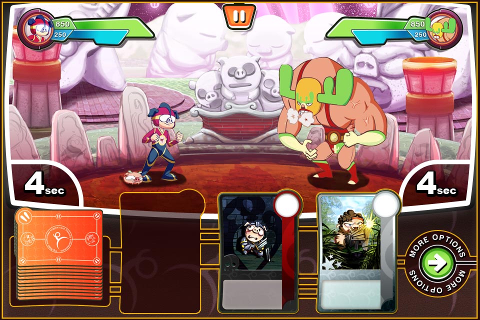
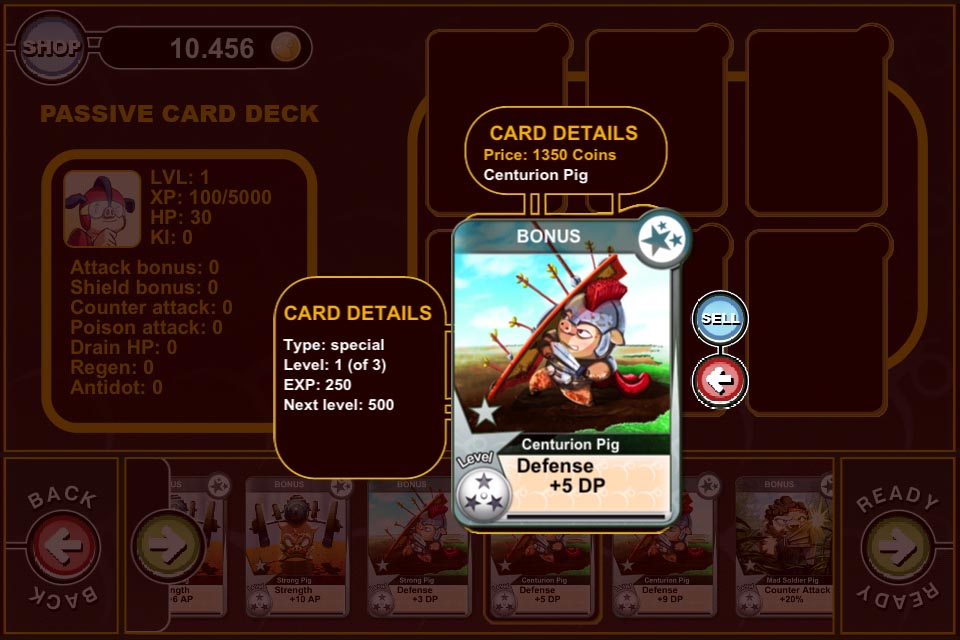
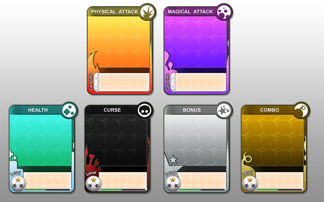
The game’s fighting mechanics were based on physical card games, with two different types of card decks and a turn-based system. In order to make the game quite dynamic, only a few turns were allowed, with very limited time for each one. You could also play a “story mode” and a “fight mode” over Wi-Fi networks and the Internet. The chosen business model was “free-to-play”, selling new card decks and scenery updates periodically; the collecting impulse was going to be one of the main driving forces behind gameplay.
Developer: Dolores Entertainment
Publisher: unpublished
Platform: iOS
My role
Main concept artist.
Gallery
SUPER 3 (2011)
General info
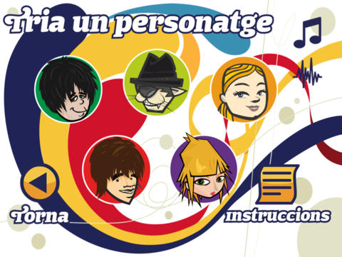
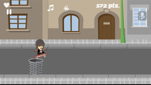
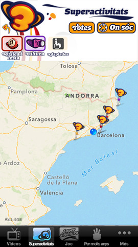
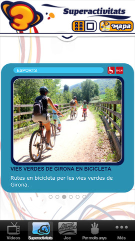
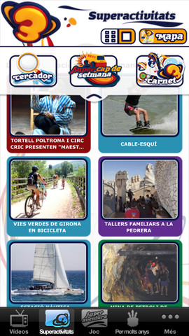
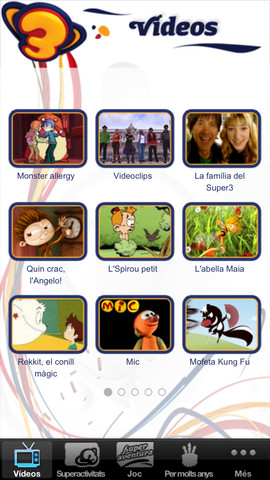
“Now, series and programs from Super3 channel are available on your iPhone! You will see a lot of Super3 family videos, Mic, Doraemon, Espies de veritat … And the most popular songs and dances! You also could hear and learn the song “Per molts anys.” Pay attention to the upcoming application updates, you will find soon new surprising features.“
Developer: Dolores Entertainment and Televisió de Catalunya.
Publisher: CCRTV Interactiva.
Web: Apple AppStore site.
My role
I worked on this project mainly as a graphic designer and composer, because most of the artwork used was provided by TV3 itself.
Gallery
SOCCER QUIZGAME (2011)
General info
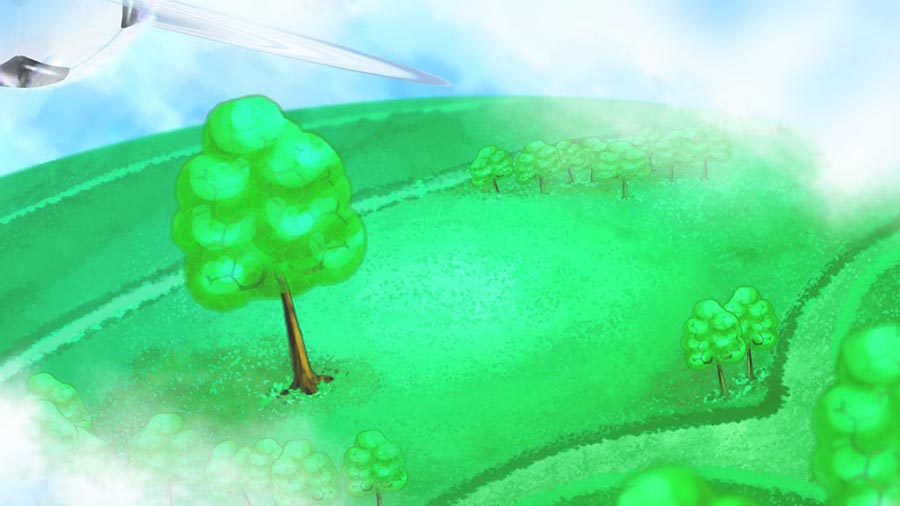
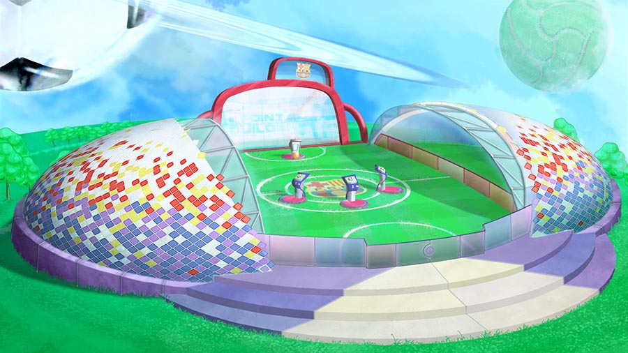
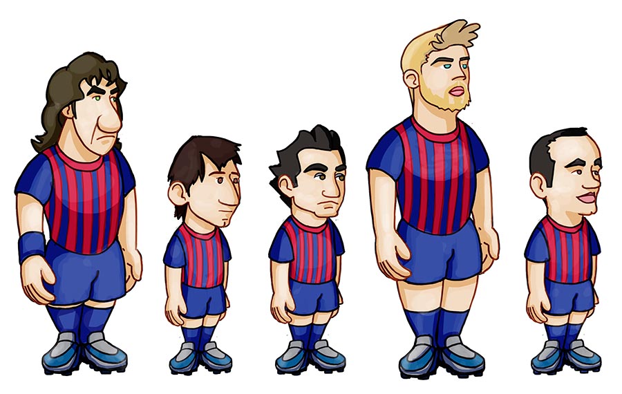
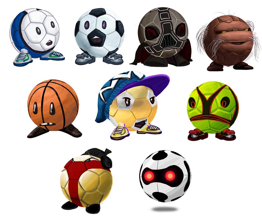
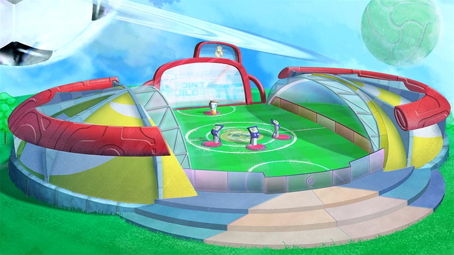
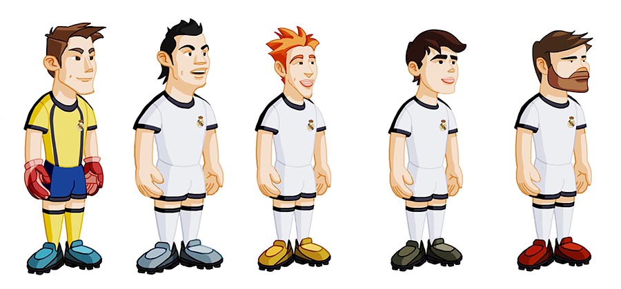
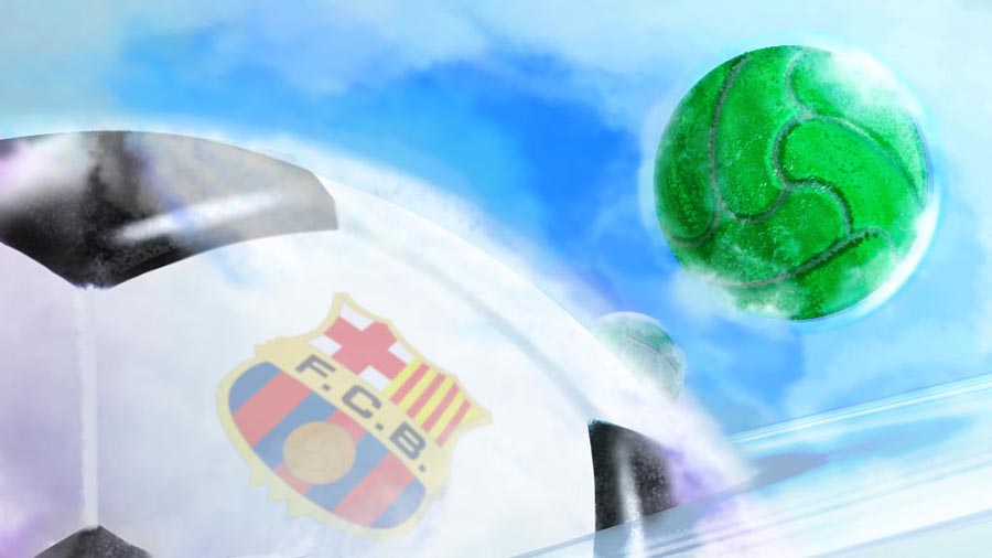
This soccer-based quiz game was offered as a potential franchise game to FC Barcelona and Real Madrid FC. Unfortunately, they were not interested or had just licensed similar games at the time. The scenario was conceived as a kind of “soccer casual universe”, avoiding dark colors and using nature, vegetation and water as the main elements. Due to this “casual” atmosphere, the characters were drawn in a quite familiar and likeable style.
Developer: Dolores Entertainment
Publisher: unpublished
Platform: iOS
My role
Main concept artist.
Gallery